Monday, 19 May 2014

Fruit n' Veg Project


The reason for my choice in subject matter was linked to the colours and patterns of the fruit and vegetables that I chose to shoot. I needed to use fruit that was partly transparent and colourful in order for the technique to work. Being too transparent would also be a problem as the light would leak out too much and show rays of light. I wanted to go down the route of commercial or advertising work so I needed to create clean and vibrant images that are not too busy and leave room for possible text, slogans or logo’s. This affected the way I approached my subjects technically as the background was very important to the image. In my earlier shoots I played with different colour backgrounds and also plain white with reflections on the light tables. The most effective images were of the glowing fruit with the deep black background to remove any distractions. To achieve this effect I used a fibre optic lighting kit to light the subjects from the inside while on a pillar so that the background would not be lit at all.
There were some issues with the final shoot and I didn’t actually know I was going to use the fibre optic lighting kit until I couldn’t get the effect I was looking for by placing the different fruit an veg over the front of a snoot blocking the light and illuminating the subjects themselves and nothing else. Too much light was leaking from the sides so I came up with the idea of lighting from the inside. I learnt how to use a new piece of equipment I had never used before and has inspired me to use it for future projects and ideas.


Thursday, 15 May 2014

The First Photo Book

During my first year of my course I was given a brief to produce a photo book based on the theme "Modern Times". I wanted to express a theory that I have involving people having their photograph taken. In generally people tend to act different around cameras or want to be seen as a certain type of person or to have a certain emotion that does not portray how they actually look or feel. A fake surface is sometime screated. An example would be holiday photographs. We all love to smile in holiday photographs even if we are not happy because, when we look back at that memory we think we were happy and remember it as a happy time. It also helps to justify the money spent and the time away as a good decision made. I want to capture natural photographs of people in public and I feel the only way to do this is to take portrait shots without people knowing they are being photographed. In theory I will not capture many people smiling but in their own emotions and thoughts. Framing of the heads of the subjects leaving room above the head for their thoughts and emotions to remain. 


The idea was greatly influenced by the work of Philip Lorca Dicorcia, in particular the book “Heads” which features portraits of people in Times Square, New York being photographed by a flash without them realizing creating a very cinematic feel but natural emotions. This lead me onto the book “Tokyo Compression” by Michael Wolf which focused on the crammed Tokyo subways where people are transported like cattle with such little room their faces are pressed against the carriage windows with no room to escape from the camera. This inspired me to photograph everyday people in everyday situation but with natural emotions.

As I will be taking my photographs from a long distance from my subject without them realizing it was important to use a zoom lens. I did not use a tripod, as I would be easier to see from a distance. A lot of images were captured, as I wanted to almost capture particular emotions or more unusual shots of somebody in the middle of yawning or calling for a taxi for example.
Once I had captured all of the images I needed I had a little trouble with sequencing my book as the images are all very similarly composed with very similar exposures and lighting I felt like the images could work in many different orders well. I decided to base my sequencing on the colours of clothes and dominating colour in the background to slowly move from different similar colours instead of people. The idea of the people being random is almost part of the concept.

Wednesday, 23 April 2014

My work in Moments in Monochrome Exhibition

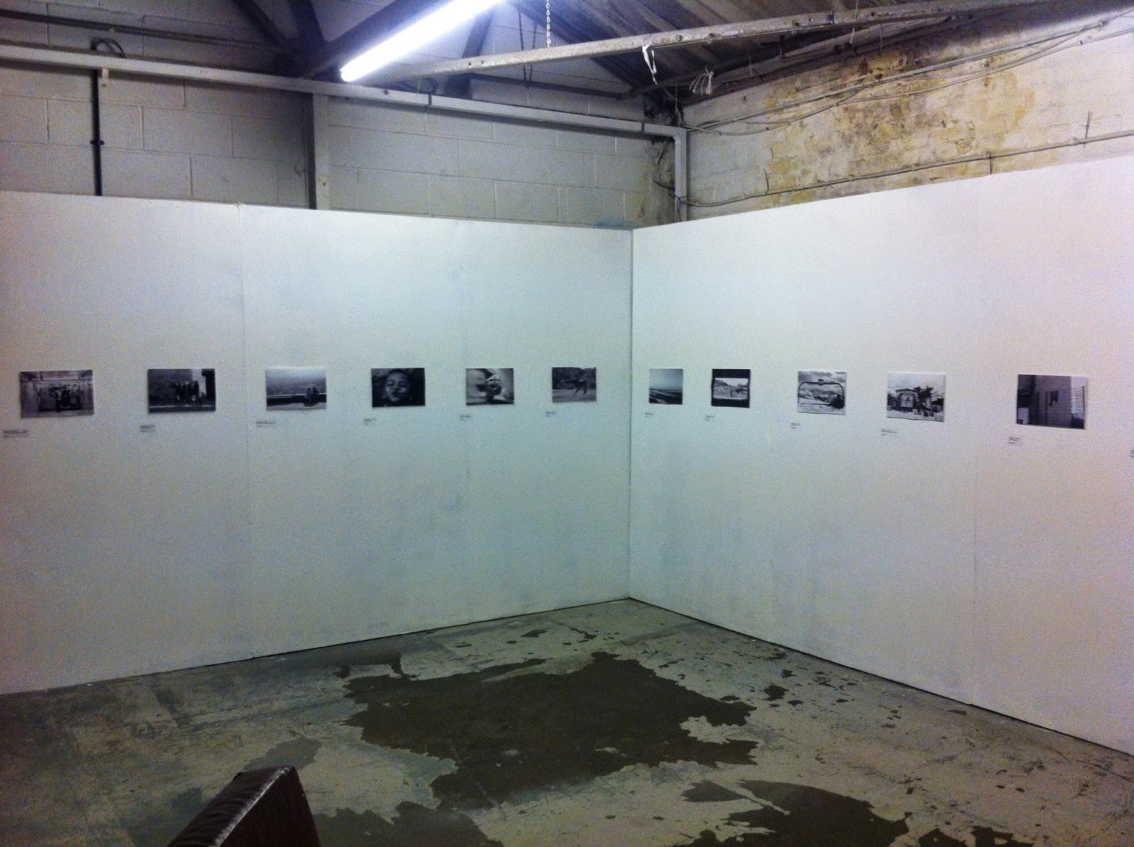
I recieved an email from one of my tutors about an exhibition based on travel photographs. I took houndreds of photographs last year during my 7 and a half months trip to Asia and decided to email 5 black and white photographs to the cruator. 2 of my photographs were selected to be put into the exhibition in sheffield at March the 12th.
I attended the privet event and met the other artists and some of their families. The turn out was good even though I did not arrive until later on. There was some great work on show and It felt good to talk about my work with other people and photographers who have the same interests in travel as I do.


One day brief Zine - Words

I was given a one day brief where I was instructed to create an online publishcation or zine onto Issue. The brief was based on 29 random words that we came up with as a group and was then asked to express 12 out of the 29 words in photographs then, upload them as a zine using powerpoint.

Zine link http://issuu.com/jamescray/docs/presentation1.pptx


The words were:
Fresh, Extreme, cooked, sparkling, damaged, dirty, narrow, helpful, stupid, shiny, dark, drab, colourful, wrinkly, wet, special, dry, bold, geometric, lovely, high, tall, smokey, transparent, smooth, grim.
I walked around the city of Leeds looking for inspiration for the shots and took most of them around the local market and then published my powerpoint on Issue.com


Thursday, 27 February 2014

Lecture by Rose Butler

Rose Butler came in to Leeds Collage of Art to show us her a range of body of work that she has produced. One particular body of work took my interest called "Platform" which involved an animation of around 3 and a half minutes of people at Blackfriars Station on the London Underground. The animation involves commuters rushing between trains and is split up between 3 frames that are synchronized together. The tempo of the animation naturally changes depending on the movement speed of the subjects creating a feel of rush and urgency involving the viewer into the work and gives a sense of the buzz of the the London Underground. The work was created by using tracking and stabilizing software and the frame is manipulated to become the main subject of the animation. The black moving frames create the concept of a train in motion passing across the camera showing just glimpses of the movement of the characters. Butler has a unique way of working and although produces a lot of film and animation see's herself as a photographer which is what gives her the style of her work. Working backwards like Butler is in my opinion a much better way to work. By working backwards I mean that you go out looking for inspiration and just begin recording or taking photographs of something that interests you and then begin to research after words. This was the work is more likely to be original instead of influenced by somebody else's work.

Fashion Brief

Editorial photography is mostly used in magazines and includes images that are not ads. A editorial photographer is given a story by a newspaper or magazine and is required to respond with a visual response linked to the theme of the magazine. We were divided into teams by our tutor and required to produce a series of images from a specific well known brand for a popular editorial magazine across 8 pages. The magazine and brand was picked at random from a hat which means that they might not link together.

As a requirement for the brief we had to compose two long shots, one close up and two mid shots with the rest being our own choice. We were also required to use flash photography on location.


My team picked Vivienne Westwood and Elle magazine as our brands and editorial which do not really suit each other so, we had to really think about the type of clothes the models will wear, the location and the lighting styles.


As a team we decided to use the theme of nature and the environment linked to the Vivienne Westwood clothes line and decided to use some woods close by as the location for our shoot. We decided to tone the style down of Vivienne Westwood's styles in order to be suitable for our editorial Elle magazine. I believe the shoot went well and we successfully met the requirements of the brief.

Page 1

Page 2

Page 4


Tuesday, 5 November 2013

White Cloth Gallery Visit


White Cloth Gallery

The white cloth Gallery is not a commercial gallery as the work is not for sale. I prefer this type of gallery because the work on the walls is much more spread out and there is one theme across the gallery, in this case black and white documentary photography, as i believe this allows me to look at each individual image and not be distracted by other work. The size of the work is also consistent so the eye can concentrate more on the image itself. The only thing I don't like about the way the work is displayed is the use of bulldog clips as they can be a little distracting however, the open plan of the gallery feel unrestricting and free to view the work in any kind of order you like.

The work displayed is by Tom Stoddard, a famous documentary photographer who has travelled to many different countries and captured a range of important historic events. There was one image in particular that really stood out for me which is part of the work “Quake…India” which is a series of photographs of the earthquake that greatly affected India in January 2001 in the town of Bhuj. 30,000 people died in the earthquake and Stoddard was able to catch the pain and suffering in his images. The photograph to the right of and old Indian woman and a cracked wall perfectly describes the suffering that took place during the earthquake. There is a link between the crack in the wall and the old woman. The cracks in the wall are similar to the wrinkles in the old woman's face which suggests that they are one and affected by each other. It expresses the idea that it is just not buildings that are destroyed but peoples lives. I believe there is a real hidden meaning behind this photograph. The composition is slightly unusual but allows the eye to flow down the crack in the wall to the old woman creating a bond between them.